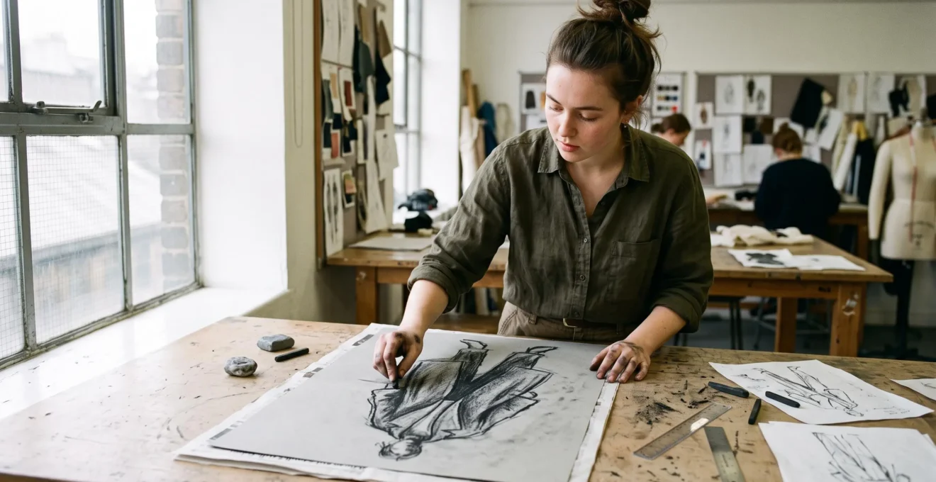
A fashion sketch can have beautiful lines and still leave the garment looking strangely flat. The shoulders seem stiff, the skirt has no weight, and every design begins to resemble the last. Often, the problem is not a lack of imagination. It is that the drawing describes the garment’s outline without communicating its volume.
Charcoal fashion sketching offers a different way to explore silhouettes. Instead of committing immediately to crisp contours, designers can build broad tonal areas, adjust edges and compare how visual weight sits around the figure. This makes charcoal particularly useful for exploring proportion, drape and the overall character of a garment.
That does not make charcoal inherently more accurate than clean line drawing. Each medium communicates different information. Charcoal can help students investigate shape before settling on details, while precise drawing remains essential when those ideas must become patterns and technical specifications.
For beginners, the most useful improvement comes from understanding when to use each approach, practising specific charcoal techniques and connecting expressive sketches to garments that could actually be made.
Charcoal fashion sketching: the essentials
- Charcoal develops silhouettes through tonal masses, helping designers assess volume and visual balance rather than relying exclusively on outlines.
- Short, focused exercises in pressure, edge quality and tonal control can make sketching more deliberate and easier to correct.
- Expressive sketches support creative decisions, but technical flats and pattern-making are needed to communicate construction and fit.
- Why Do Charcoales Make Proportions Look More “Wearable” at First Glance ?
- How to Improve Charcoal Control in 20 Minutes a Day Without Smudging Everything ?
- Charcoal or Digital Sketching: Which Gets Better Feedback in a Portfolio Review ?
- The Sketching Error That Makes a Real Garment Impossible to Pattern-Cut
- When Should You Stop “Mood Sketching” and Start Technical Flats to Hit a Deadline ?
- How to Learn Pattern-Making in the Right Order So You Don’t Get Stuck at Sleeves ?
- How to Style a Hyper-Real Print Using the 70/30 Rule So It Looks Intentional ?
- Which Pattern-Making Skills Give the Fastest Fit Improvement After 4 Weeks of Practice ?
Why Do Charcoales Make Proportions Look More “Wearable” at First Glance ?
Charcoal can make fashion proportions appear more wearable because broad tonal marks suggest how much space a garment occupies around the body. Instead of showing only its boundary, a tonal sketch can communicate volume, shadow and visual weight. This can help students evaluate a silhouette, although charcoal does not automatically produce more anatomically accurate proportions.
Consider a structured wool coat. A clean outline might show a wide shoulder, narrow waist and long hem. These features describe its boundaries, but they say relatively little about the visual relationship between the shoulders, torso and lower garment.
Using the side of a charcoal stick, a student can establish a broad, dark shoulder mass, a lighter area across the chest and deeper values beneath overlapping fabric. The differences suggest where the design feels substantial and where its shape recedes.
The distinction is between drawing a contour and drawing a mass. Contours define edges. Tonal masses help represent surfaces and the distribution of light and shadow. Both approaches can express volume, but charcoal makes broad tonal blocking particularly accessible.
The Metropolitan Museum of Art‘s explanation of charcoal drawing techniques describes how pressure, stick angle and the side of a charcoal stick produce different marks and tonal areas. These properties give fashion illustrators practical control over the transition from line to mass.
A soft edge can suggest a gradual change in fabric surface. A sharper edge may communicate a structured fold or strongly defined seam. Neither treatment is universally more realistic: the useful choice depends on the material and the lighting being represented.
Try a simple diagnostic exercise. Draw the same standing figure twice, first with contours and then with three charcoal values. Keep the pose, head size and major body landmarks consistent. Compare the torso length, shoulder width and position of the hips without looking at decorative details.
If the charcoal version makes an imbalance easier for you to notice, mark the correction on both drawings. If the contour version is clearer, use that observation instead. The purpose is to discover which representation helps you judge a particular proportion.
One danger is using blending to conceal uncertainty. Softness should reveal structure, not replace it. A beautifully blurred coat can still have an implausibly narrow armhole or an incorrectly positioned waist.
Once the main silhouette holds together without decorative shading, charcoal becomes more effective as a design tool. The next challenge is gaining enough material control to make those tonal decisions deliberately.
How to Improve Charcoal Control in 20 Minutes a Day Without Smudging Everything ?
A 20–minute charcoal routine works best when each session targets one drawing skill rather than attempting a finished illustration. Practise pressure, edge definition and tonal layering separately, while keeping your hand away from completed marks. Use a consistent charcoal-and-paper combination initially, so differences between sessions reflect your technique rather than changing materials.
Charcoal responds noticeably to pressure and contact angle. A lightly applied vine charcoal stick may produce a pale, adjustable mark; compressed charcoal can generally produce stronger darks. Paper with more texture catches charcoal differently from smoother sheets.
These variables affect the result before drawing ability even enters the picture. Start with one sketchbook and one type of charcoal for several sessions, then experiment with alternatives once the marks become predictable.
A practical 20-minute session can follow this structure:
- Minutes 0–3: Draw straight and curved strokes with gradually increasing pressure, without blending.
- Minutes 3–8: Fill five adjacent squares from the untouched white of the paper to your darkest available charcoal value.
- Minutes 8–14: Draw one simple garment shape, such as a sleeve or skirt, using a broad tonal mass and one clearly defined edge.
- Minutes 14–18: Refine the transition between light and dark without repeatedly rubbing the entire drawing.
- Minutes 18–20: Identify the cleanest edge, the muddiest passage and one specific correction for the next session.
Rather than changing everything daily, rotate the emphasis. Spend one session concentrating on pressure, another on the difference between crisp and soft edges, and another on constructing several distinct tones.
For a right-handed illustrator, working from the upper-left towards the lower-right of the sheet can reduce contact with completed areas. A left-handed illustrator can reverse that direction. The safest working order still depends on the page angle and the position of the hand.
Place a clean sheet beneath your drawing hand as a paper guard, lifting and repositioning it rather than dragging it across the surface. Keep a kneaded eraser nearby to remove excess charcoal or lift highlights.
Fixative can help reduce smudging, especially when applied to completed work. Some artists also use compatible workable fixatives between stages, but these products can change subsequent mark-making and do not eliminate transfer. Follow the manufacturer’s directions and ventilation precautions, and test on a spare sheet before treating important work.
Five checkpoints for a cleaner charcoal practice session
- Draw five pressure-controlled strokes and keep the sheet as a reference showing your lightest and darkest marks.
- Complete a five-square tonal scale and check that each adjacent square is visibly different.
- Draw one sleeve using a sharp edge on one side and a softer transition on the other, retaining both treatments in the finished study.
- Use a clean paper guard throughout a short drawing and inspect the area beneath your hand for accidental transfers.
- Annotate one completed study with a specific correction, such as reducing the darkest area’s width or restoring a lost highlight.
Neater marks are useful, but they are not the ultimate measure of progress. The real test is whether your drawing communicates a design more clearly, particularly when it becomes part of a portfolio.
Charcoal or Digital Sketching: Which Gets Better Feedback in a Portfolio Review ?
Neither charcoal nor digital sketching consistently receives better portfolio feedback across all review contexts. Charcoal can communicate gesture, tonal judgement and exploratory drawing, while digital work can demonstrate precise presentation and technical communication. Reviewers need evidence relevant to the course or role, so the strongest choice depends on what a particular portfolio page is intended to prove.
A charcoal drawing can be valuable when showing how a design evolved. The marks may reveal the artist’s first decisions about pose, proportion, fabric weight and silhouette.
A digital drawing can communicate different strengths. Clean garment boundaries, consistent colours, technical callouts and easily revised design variations may be more useful when documenting a developed concept.
The Fashion Institute of Technology‘s fashion design course catalog distinguishes skills such as figure proportion, garment rendering, digital illustration and technical flats. This supports treating these activities as complementary design competencies, not as competing media with a universal winner.
Before choosing a format, identify what each page must communicate.
| Review criterion | Charcoal sketching | Digital sketching |
|---|---|---|
| Early design exploration | Useful for gesture, tonal volume and visibly revised concepts | Useful for rapid iterations, colour variations and organised development |
| Figure and silhouette studies | Can display direct observation and expressive mark-making | Can display proportion, clarity and control with precise tools |
| Construction communication | Requires additional clarification for seams and garment details | Well suited to clean flats, measurements and annotations |
| Digital portfolio reproduction | Needs careful photography or scanning to preserve tonal range | Can be exported directly, subject to resolution and colour settings |
| Presentation consistency | Benefits from a consistent background, scale and photographic treatment | Benefits from consistent layouts, line weights and export settings |
Physical charcoal drawings can lose important detail when photographed badly. Uneven lighting may suppress delicate mid-tones, while bright reflections can make the paper appear patchy. Use diffuse illumination, keep the camera parallel to the artwork and check whether the original value range survives reproduction.
Heavy digital rendering has a different risk: decorative effects can distract from the silhouette. Test a highly rendered figure by temporarily hiding texture, colour and surface embellishments. If the remaining body and garment proportions are unclear, the illustration needs structural revision.
There is no reason to exclude mixed-media work. However, the transition between charcoal and digital should feel intentional. A consistent page grid, image scale and caption style can prevent a portfolio from resembling unrelated sketchbook extracts.
A convincing portfolio should show more than an attractive final image. It should also make the design process understandable, particularly where an expressive concept begins to become a constructible garment.
The Sketching Error That Makes a Real Garment Impossible to Pattern-Cut
The most serious construction error in an expressive fashion sketch is showing garment volume without considering how fabric pieces could produce it. A silhouette may look convincing in charcoal while leaving no workable explanation for seams, darts, openings or ease. The drawing becomes difficult to pattern-cut when its visual shape cannot be translated into pieces that join and fit around a body.
Imagine a hypothetical design: a fitted dress with a smooth waist, dramatic hip volume and no visible closures or shaping seams.
Charcoal can make this idea attractive. Deep shadows beneath the hips suggest folds, while soft edges create the impression of continuous fabric wrapping effortlessly around the body.
Yet translating that design into a pattern creates immediate questions. How does the wearer get into the dress? Where is the fabric shaped to accommodate the difference between waist and hip measurements? Which sections are close-fitting, and where is additional volume introduced?
The drawing does not necessarily need to show every seam. A hidden zip, fabric stretch, internal shaping or carefully placed panel can solve some construction problems. However, the designer must eventually identify a plausible construction method.
Garment volume must be connected to construction logic. A curved shadow cannot substitute for a dart, a seam or the extra material needed to create a fold.
Ease is particularly important. Positive wearing ease creates room between the body and garment. Negative ease may be appropriate for suitably stretchable materials, depending on the intended fit and fabric behaviour. Neither can be inferred reliably from an atmospheric tonal sketch alone.
A useful verification exercise is to place tracing paper over the charcoal drawing and identify three things:
- Where the garment opens, closes or otherwise allows dressing.
- Where its major panels, seams or shaping features could be positioned.
- Where fabric volume is created, controlled or released.
Next, compare the proposed construction with the visible silhouette. A narrow waist combined with a large sleeve, for example, may require separate decisions about bodice shaping, armhole geometry and the sleeve’s own pattern.
This is the point at which an expressive image must become a communicative drawing. The charcoal study can remain loose, but a separate technical representation should clarify what the garment actually requires.
Not every early sketch needs to be pattern-ready. The important skill is recognising when construction questions have become relevant—and moving into a drawing format that can answer them.
When Should You Stop “Mood Sketching” and Start Technical Flats to Hit a Deadline ?
Stop mood sketching when the main design decisions are settled and further expressive drawings are no longer resolving meaningful uncertainties. Once the silhouette, defining details and intended fabric behaviour are sufficiently clear, technical flats become more useful. They communicate construction information that additional charcoal refinement cannot provide, especially when a pattern-making or presentation deadline is approaching.
Charcoal exploration is valuable while comparing alternatives. A few rapid studies can help decide whether a coat should be oversized or closely fitted, whether its volume belongs at the shoulders or hem, and whether its fabric should appear structured or fluid.
But once those choices are made, continuing to shade the same concept can become a form of avoidance. The drawing improves aesthetically without necessarily moving the garment closer to completion.
Use three practical questions to identify the transition:
- Silhouette: Is the overall outline and distribution of volume decided?
- Design details: Are the important features, such as pockets, neckline, seams and fastening approach, sufficiently defined?
- Fabric behaviour: Is there a clear intended relationship between material weight, drape and structure?
If the answers are yes, move to a technical flat. If one answer remains uncertain, make a targeted sketch to resolve that decision instead of reopening the entire concept.
A technical flat shows the garment without the expressive distortions of a fashion pose. Front and back views can communicate seam locations, panel shapes, closures and proportional relationships. Annotations can then describe elements that the drawing alone cannot specify.
For deadline-driven projects, allocate time to each drawing phase before starting. As a hypothetical planning example, a student with a limited design session might reserve an initial block for exploration, a larger block for technical flats, and a final block for annotations and review.
The precise allocation should depend on the assignment. A highly experimental silhouette may need more exploration, while a familiar garment with complex construction may require more technical work.
The main principle is that early exploration reduces design uncertainty, whereas later technical drawing reduces communication and construction uncertainty. These are different problems, and each deserves its own tool.
Once the garment has a clear technical representation, pattern-making becomes the next test of whether its intended silhouette can exist beyond the page.
How to Learn Pattern-Making in the Right Order So You Don’t Get Stuck at Sleeves ?
Learn pattern-making in an order that builds from measurements and basic blocks towards shaping, style lines and sleeve construction. Sleeves require an understanding of the bodice and armhole they attach to, so learning sleeve drafting before establishing a reliable bodice block can create avoidable confusion. A staged approach makes it easier to identify which earlier decisions need correction.
Start with body measurements and the purpose of a basic block. A block is a starting pattern representing a defined fit and body shape. It is not necessarily the finished garment pattern.
Measurements must be accurate and consistent, while the resulting block needs checking against the intended wearer or fit standard. A carefully drawn block is not automatically a well-fitting one.
Next, practise manipulating simple bodice and skirt shapes. Explore changes in length, width and shaping without introducing several unfamiliar construction problems simultaneously.
After these foundations, study dart manipulation and style lines. Rotating a dart can redistribute shaping while retaining its underlying purpose, although the final pattern still needs to be evaluated for the chosen fabric and design.
Only then introduce more complex sleeve and collar drafting. This is a recommended learning sequence, not a universal curriculum; particular garment types may justify a different order.
A set-in sleeve is an instructive example. Its cap must work with the corresponding armhole, and the placement of ease affects how the sleeve hangs and moves.
New Mexico State University‘s sleeve construction guide explains that a conventional set-in sleeve is shaped and eased into its armhole. Its instructions also show why coordinated markings and seamlines matter during construction.
If a sleeve repeatedly twists or pulls, examine the full relationship between bodice, armhole and sleeve rather than immediately redrawing the sleeve cap. Possible causes can include the sleeve itself, the bodice balance, construction accuracy or a combination of factors.
Charcoal sketching can support this learning process by establishing a clear visual intention. A tonal study may show a relaxed sleeve collapsing in folds or a structured sleeve maintaining a distinct outer shape.
Then ask how the pattern could create that appearance. Does the sleeve need extra width, a different cap shape, added seams or a more suitable fabric? The sketch supplies the design target; drafting and fitting test the solution.
Before tackling a complex sleeve, check whether a basic bodice toile sits correctly at the shoulders and armhole and permits the intended movement. Unresolved bodice problems can complicate the assessment of a new sleeve.
With construction fundamentals in place, the next challenge is controlling visual emphasis. That matters not only for garment shape but also for how strongly patterned fabrics interact with a silhouette.
How to Style a Hyper-Real Print Using the 70/30 Rule So It Looks Intentional ?
The 70/30 rule is a practical styling heuristic: allow approximately 70% of a look’s visual weight to come from quieter elements and reserve around 30% for a striking hyper-real print. It is not a measured design law. Its purpose is to establish a dominant focal point while preventing competing colours, textures and shapes from overwhelming the intended silhouette.
A hyper-real print might depict flowers, architecture, food or another recognisable subject with photographic detail. Unlike a simple repeating motif, it can demand attention through texture, contrast and image complexity.
The challenge is making that attention feel deliberate. A highly detailed print combined with multiple dramatic accessories, contrasting prints and elaborate garment shapes may create several competing focal points.
The 70/30 approach encourages a clearer hierarchy. A garment with a prominent photographic print might be paired with a quieter skirt, jacket or accessories. Alternatively, a small but exceptionally high-contrast printed area could command attention within a much larger neutral silhouette.
Visual weight is not the same as surface area. A small, bright print near the face may attract more attention than a considerably larger low-contrast panel near the hem.
Three design decisions help make the relationship intentional:
- Scale contrast: Pair large, detailed imagery with relatively simple surrounding shapes so the print remains readable.
- Colour repetition: Select one colour from the print and repeat it in a solid garment piece or accessory to create a connection.
- Placement: Position important printed details with the body’s proportions in mind, considering seams, folds and areas of visual emphasis.
Charcoal is useful during the planning stage because it allows the designer to test tonal placement without becoming distracted by the print’s colour palette.
For example, in a hypothetical jacket design with a large photographic flower on one side, shade the printed area as a dominant dark mass. Keep the surrounding garment at lighter values and examine whether the composition appears balanced.
Try a second drawing with the same dark mass moved towards the centre. Compare which arrangement supports the shoulder line and the overall shape. The exercise tests composition, not the actual colour accuracy of the final fabric.
Once the tonal relationship works, introduce a colour mock-up or printed fabric sample. Check whether the image remains recognisable across folds, seams and changes in scale.
The common mistake is adding more statement pieces in an attempt to balance a bold print. This often increases competition rather than creating harmony. Simpler supporting elements can be more effective because they give the main image room to function.
When a silhouette and its surface design have both been resolved, the next measure of progress is physical fit. A successful illustration must eventually withstand the scrutiny of fabric, movement and construction.
Key takeaways before fitting your design
- Keep design intent separate from construction evidence: an attractive charcoal silhouette is a target, not proof that a pattern fits.
- Prioritise a reliable basic block before experimenting with complicated garment details, especially sleeves and close-fitting shapes.
- Judge progress through repeated toile corrections, not through the number of unrelated patterns drafted.
Which Pattern-Making Skills Give the Fastest Fit Improvement After 4 Weeks of Practice ?
Over four weeks, beginners are likely to gain the most practical fitting value from accurate measurements, basic-block adjustments, dart placement, ease assessment and shoulder–armhole balance. These skills address foundational relationships affecting many garments. Four weeks is a useful practice window, not a guaranteed improvement period: results depend on existing ability, practice consistency, garment complexity and fitting feedback.
The most productive starting point is a single, relatively simple garment. Repeatedly fitting and correcting the same bodice or basic dress can reveal more than drafting several unrelated designs without testing them.
Begin by confirming measurements and examining the basic block. Check whether key landmarks align with the intended body and whether the garment hangs as expected.
Next, investigate darts and shaping. A dart positioned incorrectly may contribute to unwanted tension or fullness, while a properly adjusted shaping feature can improve how fabric follows the body.
Ease deserves equal attention. Too little room can restrict movement or create strain; too much may produce unintended folds. The correct amount depends on the garment style, fabric and desired fit.
Shoulder and armhole relationships are another productive area. An uneven shoulder line or poorly balanced armhole can influence how the garment hangs and how a sleeve behaves.
Use this four-week practice plan as a structured teaching exercise rather than a prediction of measurable results.
| Week | Skill focus | Practical deliverable |
|---|---|---|
| 1 | Measurements and basic-block assessment | A measured block and first fitted toile with clearly marked discrepancies |
| 2 | Dart position and garment shaping | A revised toile showing one documented shaping correction |
| 3 | Ease and shoulder–armhole balance | A corrected toile with notes on fit and movement |
| 4 | Consolidation and retesting | An updated working block supported by comparison photographs and fitting notes |
For each fitting, photograph the garment consistently from the front, side and back. Mark required changes directly on the toile or record them against the corresponding pattern piece. Transfer corrections carefully, and distinguish between adjustments that have been tested and those that remain provisional.
Change one major fitting variable at a time whenever possible. If the shoulder, waist and armhole are altered simultaneously, it becomes harder to identify which correction produced a useful result.
Charcoal studies can contribute to this process, but their role should remain specific. Sketch the intended distribution of garment volume, then compare that visual target with the toile. This may help you identify where the made garment differs from the design.
For example, if a charcoal study shows a smooth shoulder transitioning into a full sleeve, but the toile develops unintended bunching near the armhole, investigate the pattern and fabric behaviour. The sketch identifies the discrepancy; fitting determines its cause.
The improvement worth seeking after four weeks is not simply a more beautiful illustration or a larger collection of patterns. It is a better-understood block, a clearer record of fitting decisions and a repeatable method for evaluating future designs.
Choose one charcoal design, translate it into a clear technical flat and develop a basic toile for fitting. Document what changes between the three stages. That comparison is a practical way to strengthen drawing, design communication and pattern-making together.
Is vine charcoal or compressed charcoal better for a beginner?
Vine charcoal is a useful starting choice for loose gesture drawings and adjustable tonal studies because it generally produces lighter marks that are relatively easy to lift. Compressed charcoal is useful when stronger darks are needed, although it can be harder to remove completely. Beginners can start with one type and learn how it behaves on their chosen paper before combining materials.
Can charcoal fashion sketches be included in a UK university portfolio?
Charcoal sketches can demonstrate relevant drawing and concept-development skills, but portfolio requirements depend on the individual university and course. Check the current submission instructions, select work that supports the course’s assessment criteria, and reproduce physical drawings clearly. Include relevant design development and technical work where requested rather than relying exclusively on finished illustrations.
What type of paper works best for fashion sketches in charcoal?
Paper with some texture can retain charcoal particles and support layered tonal marks. Smoother paper may suit a different drawing approach but can behave differently under blending and erasing. Test several strokes, value transitions and eraser corrections on a sample before choosing a sheet for an important illustration.
Should fashion illustration use realistic body proportions or elongated fashion figures?
Both have legitimate uses. Elongated fashion figures can emphasise movement and stylistic character, while more realistic proportions may make certain construction and fit relationships easier to assess. The important distinction is between deliberate stylisation and accidental distortion. For pattern-making decisions, use accurate measurements and appropriate technical references rather than relying on fashion-figure proportions.
Do you need advanced drawing skills before learning fashion pattern-making?
No. Basic drawing skills help communicate design intent, but pattern-making also depends on measurement, geometry, fabric behaviour and practical fitting. A beginner can practise charcoal silhouettes alongside simple blocks and toiles. Learning both progressively makes it easier to connect the desired appearance of a garment with the steps required to construct it.